Devlog 3 # Beta
Devlog#3 Beta
Since the last Devlog, we have starting working on the vertical slice of the project. By this point we are not adding anymore features, but more so refining them or changing aspect depending on the feedback we received. My focus for this phase was to once again work on the assets of the game. I am trying to ensure that every part of the game got the first art pass.
Once again, a small recap is that we are working on a game with the goal to reduce the stigmas around opioid addictions. We are trying to make our player understand that people that have fallen for opioid reliance are not always in it by choice and that different event may push them toward it. With that in mind, we wanted to communicate the event of our main character Jessica going from their regular life to the different changes her reliance would have.
1. Different scene visuals.
- Office Scene
- Hospital Scene
- Date scene
- Hobby scene
Throughout the vertical slice, the player will experience the life of Jessica and seeing the many aspects of her life. Players will be exposed to her hobby, her work, her romantic relationship and lastly her visit at the hospital. To do that, I needed to create visuals that would be clear to the player without having to give too much context.
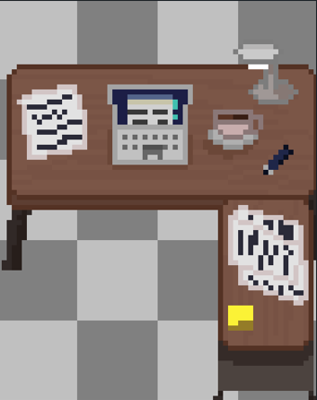
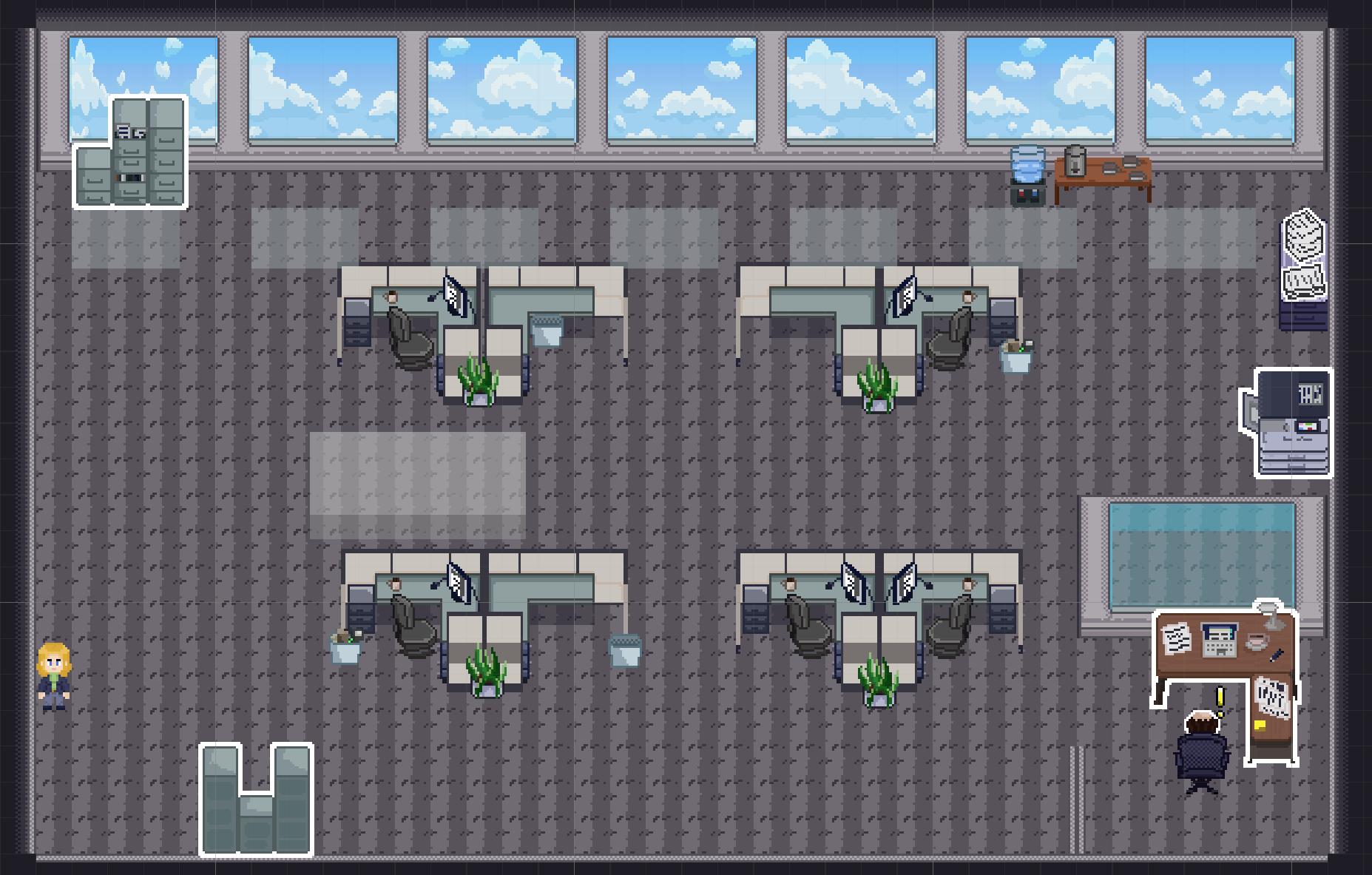
A. Office Scene
For the office space, the focus was to capture a somewhat generic office. After gathering different references for office spaces, I decided to go with a general cold color palette. Using the previous devlog assets for the floor tiles and desk (show in the table below) I went ahead and designed the props that would populate the office.
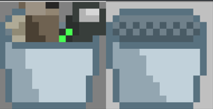
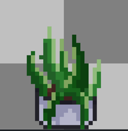
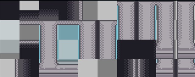
- Office space:
| Asset | Screenshot |
| Printer
| 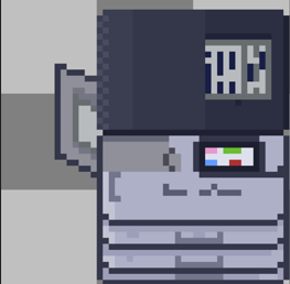
|
| Cabinet |
|
| Back Cabinet
|
|
| Water Machine | 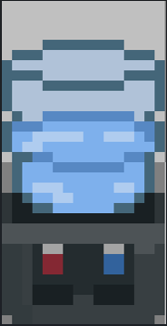
|
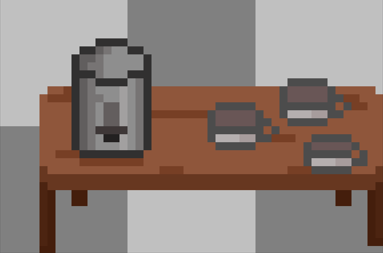
| Coffee Table |
|
| Boss Desk
| |
| Trash Can
|
|
| Plant
|
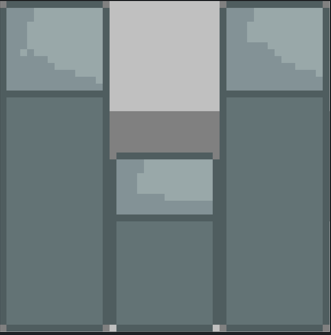
|
| Wall TileSet
| |

What we learned:
With that in mind, one of the challenges was to make an office space that would feel busy and lively while ensuring that we are not overwhelming the player with information. To do that we did have the highlight appear on the different interactable throughout the scene but I also had to make sure that the placement of each objects through the level was purposeful and that players would confuse it for a background prop. Lastly, to reinforce the color palette choice, after some research in about the psychology behind color picks and their impact on office space. (From this source) I decided to double down and make the office pallet utilize more cool greys.
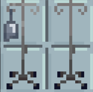
- Hospital Scene:
For the Hospital Scene, my goal was the setting was instantly recognizable at a glance. After a few visits to the hospital and gathering references online. The apparent color that I decided on was once again a light surgical blue. I made sure to use props throughout the scenes that would make the environment recognizable for players to associate it to a medical setting.
| Asset | Screenshot |
| Floor Tileset | 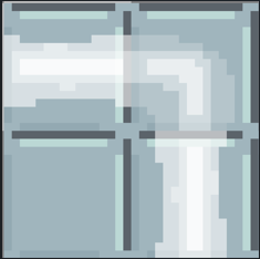
|
| Door Light | 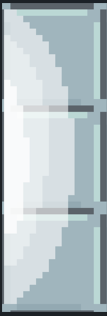
|
| Hospital Chairs | 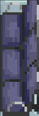
|
| Hospital Bed | 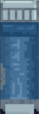
|
| Wall Tileset | 
|
| IV’s | |
What I learned:
One of the main challenges for the hospital scene was when balancing the clarity poand emotion of the scene while once again, making it visually recognizable. I needed to ensure that the space didn’t feel too generic and empty while making sure the player would understand what they had to do.
- Hobby Scene :
For this one it was pretty simple, we had already decided on the game resolution of the game being 256x144. With that in mind, my goal was just to design a cozy coffee shop environment. After a few trial and error I settled on a general warmer color palette. From earthy browns for the tables and coffee cup to a warm grey being used on the counter and the walls. With Jessica’s 2 friends being shown, I also wanted to make sure that the coziness was reinforced. This led to their outfit being more baggy and warm outfits.
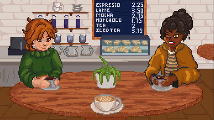
What I learned:
For this scene overall, there was a few things that I needed to remind myself. Less detail is sometime better. I was going with the mindset of making the ideal coffee shop, but half of the detail ended up being hidden by the characters shown. Another lesson was that dedicating more time for the character design early on may have been better. For these design and the later design there wasn’t much room for iteration due to time restrictions. Therefore for future design, I would like to spend more time on the actual character design phase.
- Date Scene:
Similarly to the hobby scene, it was a very similar process. This time when gathering references, I had to ensure that there would be no alcoholic drinks in the image. From earlier feedback we want to be careful with our communication and avoid telling the player that Jessica may be having some alcohol problems. I once again tried going with a warmer color palette for the table and Lee (Jessica’s romantic partner). And a colder palette for the chair and his outfits to contrast more.
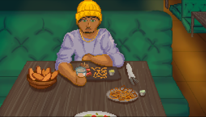
What I learned:
For this one after a bit of feedback, some of the reception was that the current version of Lee was more crude. I may have to revisit the character design and change certain features as I am trying to capture the character being soft and gentle. This will be in the polish phase as the last few priorities are to make sure that everything within the game has had at least one art pass.
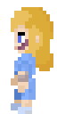
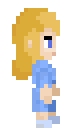
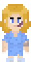
2. Character Animation
Alongside the first art pass in the office, I needed to work on the in game character sprites. Many of the feedback from the previous playtest sessions were toward the bald character placeholder we had. Some even asked why am I playing as a baby. To remedy that I worked on a few animation sets.
This included:
| Direction | Animation (Office) | Animation Hospital |
| Idle Up |  |  |
| Idle Left | 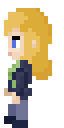
|  |
| Idle Right | 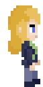
|  |
| Idle Down | 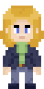
|  |
| Walk Up | 
|  |
| Walk Left | |  |
| Walk Right | |  |
| Walk Down | |  |


Jessica was given a different set of animation of animations for her office and hospitals as you will be able to control her in both sections.
Meanwhile as her boss will always be seen from their back, only one animation was needed.
| Direction | Animation |
| Idle Up | 
|
3. Office Level Design Update
The last major change that was done for this phase was to update the level of the office to bring in more life. The level now has more life with the added props and feels more like an office. The exact location of the interactable will have be tweaked with the values of the pain killer but we will need to test the values in the game to get a feel for that.
4. Playtesting Focused
Lastly, once again before playtesting we need to ensure that the players will give us the feedback we need. We have been hard at work making sure that there are as little bugs as possible. On top of that we are still working on adding a lot of signifiers to help the onboarding of the player without throwing too many text boxes at them.
5. What did we learn from the last few weeks.
From the last few weeks of work, the importance of a schedule was very apparent. Even thought I had a schedule made for the assets, I realized that I wouldn’t be able to get everything done on time. Being able to be flexible and adapt to the new needs and demand from the team was needed but I think overall that it is still a good experience. Lastly, I think it’s a good thing to have a cut-off for feature additions as we tend to always want to do more. Knowing when to pull the plug and start refining rather than adding more features was a good call that we had to make.
Leave a comment
Log in with itch.io to leave a comment.